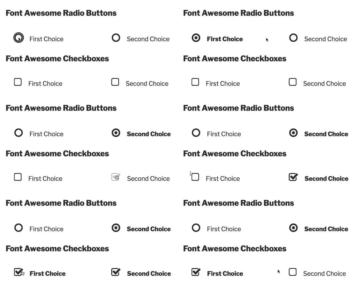
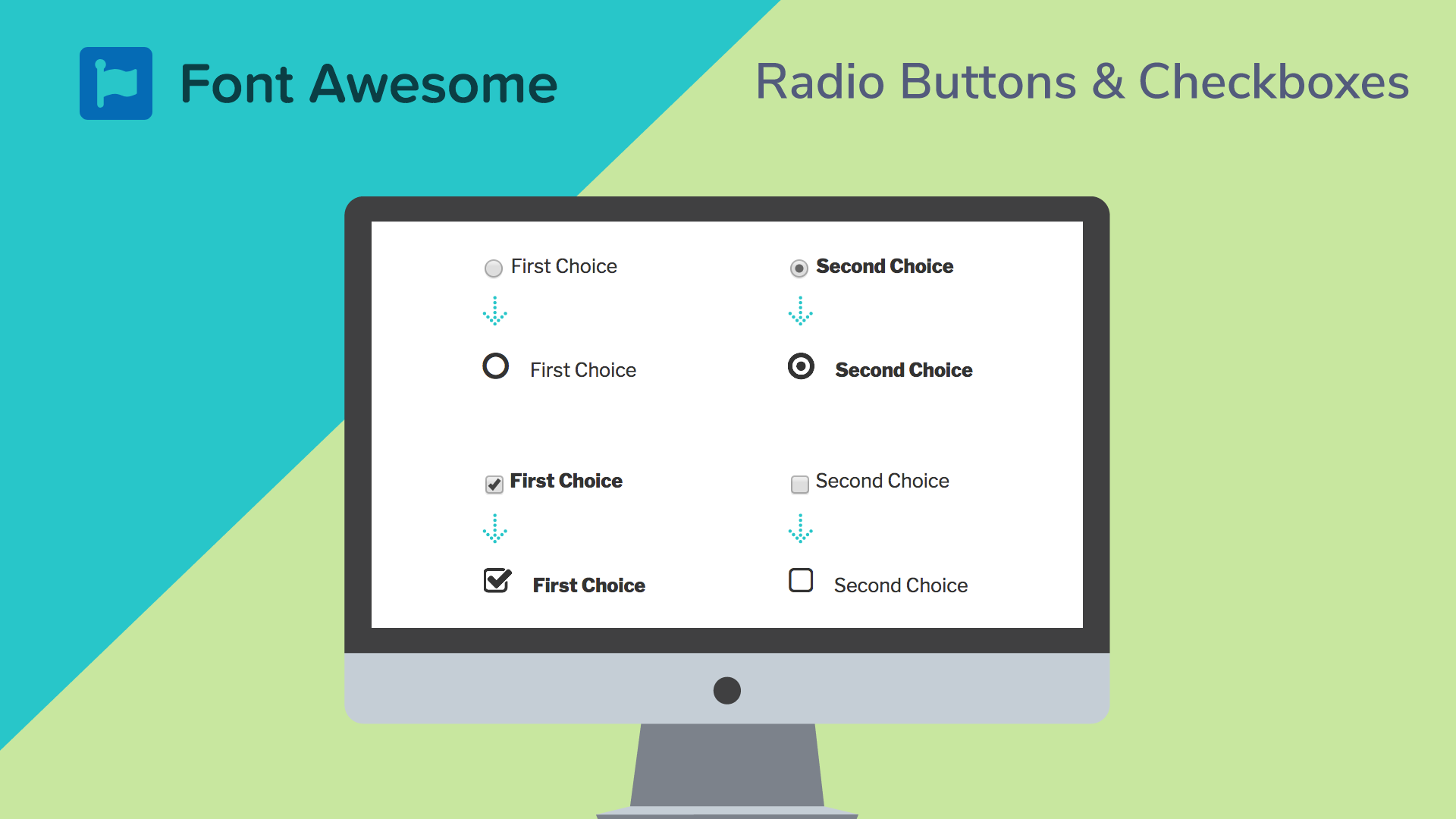
I previously posted a guide on how to use the Divi theme’s icon font for making boring checkboxes and radio buttons look much cooler and more “Divi-like.” Almost immediately I had people asking how they could do the same thing with Font Awesome’s font icon. I applied the same CSS, with some Font Awesome tweaks, and was able to do the same thing. Here are the results:

Update 23 Feb 2019: As noted in the other post, the best way to do this is by adding it to the label. This may not work with some plugins, who structure the label and input in a way that can’t be easily styled. It does contain special selectors for the WooCommerce terms checkbox.
Styling Radio Buttons & Checkboxes in Forms
Do you agree these look way nicer than the default Windows or Mac checkboxes? Here’s the problem: you can not style radio buttons and checkboxes! They are set by the operating system and don’t respond to CSS. So here’s the trick: you hide the ones created by the OS, and replace with your own. So you’ll see in the CSS below that I first hide them, then use the :before pseudo element to insert the Font Awesome icons “before” the input field.
Loading Font Awesome
In order to use Font Awesome icons, you need to load the font on your site. If you’re already using a plugin, theme, or custom code that does this for you, then you can proceed with the CSS and skip this part. For everyone else, you need to add Font Awesome. You can add the code directly to your theme or if your theme has a place to load scripts. I used the plugin Better Font Awesome. It’s claim to fame is that it always loads the latest version of FA.
However, it’s not been updated to support Font Awesome 5. There’s a beta version for that, but it’s pretty buggy as of my writing this. So the CSS below isn’t verified to work with FA 5. I’ll update it once this plugin supports it, or I have another easy way to test. All you need to do is install and activate Better Font Awesome. That should load FA 4.7 on your site and allow the CSS below to work.
The Magic CSS
Here’s the CSS I wrote to do that, with comments to help if you need to modify. I put this in the Divi theme‘s custom CSS under Divi > Theme Options > Custom CSS, but you can put it in your theme’s custom CSS field or in the Customizer under “Additional CSS”:
/** SECTION 1 **/

/* Hide the OS/Browser checkboxes/radio buttons */
input[type=checkbox], input[type=radio] {
  visibility: hidden!important;
  margin: 0!important;
  width: 0!important;
}

/* Set Font Awesome font, size, & positioning for the checkboxes/radio buttons plus the cursor on hover */
input[type=checkbox] + label:before,
input[type=checkbox] + span.woocommerce-terms-and-conditions-checkbox-text:before,
input[type=radio] + label:before {
  visibility: visible;
  font-family: "FontAwesome"!important;
  font-size: 25px;
  position: relative;
  top: 5px;
  padding-right: 8px;
}

input[type=checkbox] + label:hover,
input[type=checkbox] + span.woocommerce-terms-and-conditions-checkbox-text:hover,
input[type=radio] + label:hover {
  cursor: pointer;
}

/** SECTION 2 **/

/** SECTION 1 **/

/* Hide the OS/Browser checkboxes/radio buttons */
input[type=checkbox], input[type=radio] {
  visibility: hidden!important;
  margin: 0!important;
  width: 0!important;
}

/* Set Font Awesome font, size, & positioning for the checkboxes/radio buttons plus the cursor on hover */
input[type=checkbox] + label:before,
input[type=checkbox] + span:before,
input[type=radio] + label:before {
  visibility: visible;
  font-family: "FontAwesome"!important;
  font-size: 25px;
  position: relative;
  top: 5px;
  padding-right: 8px;
}

input[type=checkbox] + label:hover,
input[type=checkbox] + span:hover,
input[type=radio] + label:hover {
  cursor: pointer;
}

/** SECTION 2 **/

/* Set checkbox to FA icons: normal, hover, checked, & checked hover */
input[type=checkbox] + label:before,
input[type=checkbox] + span:before {
  content: '\f096'!important;
}
input[type=checkbox] + label:hover:before,
input[type=checkbox] + span:before {
  content: '\f046';
  filter: alpha(opacity=20);
  opacity: 0.2;
}
input[type=checkbox]:checked + label:before,
input[type=checkbox]:checked + span:before {
  content: '\f046'!important;
}
input[type=checkbox]:checked + label:hover:before,
input[type=checkbox]:checked + span:hover:before, input[type=checkbox]:checked + label:before,
input[type=checkbox]:checked + span:before {
  filter: alpha(opacity=100); opacity: 1;
}

/* Set radio buttons FA icons: normal, hover, checked, & checked hover */
input[type=radio] + label:before {
  content: '\f10c'!important;
}
input[type=radio] + label:hover:before {
  content: '\f192'!important;
  filter: alpha(opacity=20);
  opacity: 0.2;
}
input[type=radio]:checked + label:before {
  content: '\f192'!important;
}
input[type=radio]:checked + label:hover:before {
  filter: alpha(opacity=100); opacity: 1;
}
This should impact all the checkboxes and radio buttons on your site including forms plugins, comment opt-in boxes, etc. I did include a little CSS for Gravity Forms (since that’s what I use) at the bottom. You may need to customize that part to work with your forms plugin, but it should work with WP Forms, Caldera Forms, Ninja Forms, etc.
Do You Need Help With This?
Is this too technical? Or maybe you’re just too busy? Sign up for one of our WordPress management plans, and we’ll do all this for you as part of the included design tweaks.


Hey Tevya, nice piece of work. My contact form checkboxes looks so much better now especially on mobile. I increased the font size to 22 where the extra size of the checkboxes helps with fat fingers 🙂
Best of all it took literally 5 minutes to implement.
Check it out on my contact page https://dsfmortgagebrokers.com.au/contact/
Thanks
Awesome Denis! Looks great.
Hi Tevya,
Great post, I tried on my wordpress site, but the accept terms and condition check-mark box for woocommerce does not change with it the rest does. It that extra css code?
Regards, Michael
Hi Michael, I didn’t check that use-case. I’d be happy to look at it, but don’t have Font Awesome checkboxes setup on a site with WooCommerce, to test. I don’t speak Dutch, so I wasn’t able to check on your site. Any way you can help me get to the checkout page? I’d be happy to look there, and recommend a solution.
I know it’s a been a long time. But just wanted to let you know we updated the CSS above so that it should work with ALL checkboxes, regardless of what plugin is generating them. Though some positioning tweaking may be needed.
Hi Tevya.
Thank you for this great article.
I tried it with survey likert radio buttons, but it didnt work.
Do you know how I can get it work with this question type?
Thanks.
Hi Stain, can you tell me more about these? What plugin are you using? A link to view the actual survey form would be most helpful. Thanks.
Hi Tevya,
Great post, i managed to get the radio buttons sorted but not the check-boxes on woo-commerce. The FA on your code supports my site but the woo-commerce needs a piece of extra coding i guess which i am not able to sort out. The checkbox is being hidden, but the FA linked doesn’t show.
Can you please help?
Hi Rifadh, I’ve since updated the CSS above, again. It now includes custom selectors for the WooCommerce terms checkbox. However, other checkboxes may not be styled, if they’re not properly setup.
Hi Tevya
FYI this doesnt work with radio buttons on AutomateWoo plugin, they are hidden.
Beside that this is awesome, thankyou so much, i was struggling for a while, now converted Woocommerce to FA5 checks and radio’s
Glad it worked for you! I don’t have AutomateWoo plugin to add it. But am happy to add to the CSS if people want to provide solutions for various other plugins.
thankyou, very useful for me.
Hi,
Thx for the solution, on desktop, works fine however, on mobile (android, chrome) it does not work. Showing only ‘crossed boxes’. How could I fix that?
Hi Peter, you’d have to use some mobile dev tools to see what’s going on. But usually if you get that, it’s not loading the icon font properly. So you might want to check why Font Awesome isn’t loading correctly on mobile. Perhaps some caching you have in place is messing up the CSS or some other issue preventing the CSS or Font Awesome from loading on mobile?