

Let’s face it: the WooCommerce “My Account” page navigation is, quite frankly, underwhelming in its default styling. If you’ve ever taken a look at it, you’ll notice that it’s simply a basic, bulleted list. There’s no flair, no visual hierarchy, and no real effort to make the user experience more engaging or functional. For businesses aiming to provide an exceptional online shopping experience, this basic layout simply doesn’t cut it.
In fact, when using popular WordPress themes like Divi, which we rely on for most of our website builds, the default WooCommerce “My Account” page becomes even more frustrating. Every link in the list appears the same, with no differentiation between the active or inactive links. It’s essentially a sea of the same color, making it hard for users to know which section they’re currently in. The lack of visual indicators leaves users guessing, and navigating the “My Account” page feels more like a chore than a seamless, enjoyable part of their journey.
So, what’s the solution? Fortunately, with a few simple tweaks, you can transform the WooCommerce “My Account” page from a boring, functional page into a sleek, user-friendly experience. Customizing the design not only helps with visual appeal but also improves usability. In this post, I’ll walk you through how to add some much-needed styling to the “My Account” page to improve both its aesthetics and its functionality.
Check it out: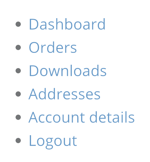
It’s pretty plain and unhelpful, right? So I set to work to improve it with CSS. Here are the results: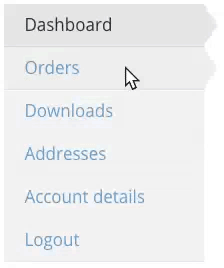
To achieve the results mentioned above, I wrote the following CSS, which should work with most themes, especially if you’re using a full-width layout without a sidebar. This custom CSS allows for a cleaner, more professional look by adding styling elements that enhance the visibility of active links and create a more intuitive user experience. By applying this CSS, you’ll be able to visually differentiate between sections on the “My Account” page, ensuring that users can quickly and easily navigate through their account settings.
It’s a simple yet effective way to elevate the design and usability of your WooCommerce “My Account” page, regardless of the theme you’re using. However, you may need to tweak a few things to fit your theme’s needs.
/* Change WC Acct Page Column Widths */
@media only screen and (min-width: 769px) {
  .woocommerce-account .woocommerce-MyAccount-navigation {
    width: 22%;
  }
  .woocommerce-account .woocommerce-MyAccount-content {
    width: 75%;
  }
}
/* Style WC Account Endpoint Links */
nav.woocommerce-MyAccount-navigation ul {
  list-style-type: none;
  padding-left: 0;
  max-width:200px;
  font-size: 17px;
  line-height: 26px;
}
nav.woocommerce-MyAccount-navigation ul li {
  padding: 8px 20px;
  background-color: rgba(0,0,0,0.05);
  border-bottom: 1px solid rgba(0,0,0,0.05);
}
nav.woocommerce-MyAccount-navigation ul li.is-active {
  background-color: rgba(0,0,0,0.1);
}
nav.woocommerce-MyAccount-navigation ul li.is-active a {
  color: rgba(0,0,0,0.8); cursor: default;
}
nav.woocommerce-MyAccount-navigation ul li.is-active:after {
  content: "";
  height: 0;
  width: 0;
  border-top: 20px solid transparent;
  border-left: 14px solid rgba(0,0,0,0.1);
  border-bottom: 20px solid transparent;
  float: right;
  margin-right: -34px;
  margin-top: -7px;
}
nav.woocommerce-MyAccount-navigation ul li:not(.is-active):hover {
  background-color: rgba(0,0,0,0.07);
}
nav.woocommerce-MyAccount-navigation ul li:not(.is-active):hover:after {
  content: "";
  height: 0;
  width: 0;
  border-top: 20px solid transparent;
  border-left: 14px solid rgba(0,0,0,0.07);
  border-bottom: 20px solid transparent;
  float: right;
  margin-right: -34px;
  margin-top: -7px;
}
If your theme has a “Custom CSS” box in it’s settings, then you can place this there. On Divi, I just placed this in the page’s custom CSS so that it only loads on the actual My Account pages.
If you have questions about what any of the CSS does or how it works, please let me know in the comments.
Want Someone to Do This For You?
Here at wpXPRESS we do tweaks like this for our members. We could do this, other content and design tweaks, plus full management and maintenance, if you became a member. Learn more about what our plans include.
While WooCommerce provides a functional “My Account” page by default, there’s so much potential to make it more visually appealing and user-friendly. By customizing the layout, improving styling with CSS, and making the page mobile-friendly, you can significantly enhance the user experience. This is especially important when you consider how many customers use this page regularly to track orders, manage their accounts, and interact with your online store.


Thank you! Worked great, super easy.
Thankuuuuuuuuu Worked greatttt, superrrrr easy.
Hi! This is great – thank you!
Can you tell me what part of the code is creating the static arrow/triangle to the right of the button that is active or when hovering? It’s not working exactly right on my end (perhaps there is some competing CSS in my theme?), but I’m not sure what to tweak… Thank you!
Stacey, I believe it’s the portion starting with the line “nav.woocommerce-MyAccount-navigation ul li.is-active:after {” to the end. You can add a /* before that line and a */ at the end of this CSS to “comment out” that portion. See if that does what you want, then remove it entirely, if it does. Or you can play with some of the values in those lines (such the widths of the borders or the negative margins), to see if you can get it to position correctly for your theme.
Thank you very much !!!
You are awesome – this looks soooo much better. Any chance you’d do a future post on how to style the checkout page to spruce it up a bit?
Definitely. I improved one a little today. Not sure it’s enough to write about. However, I have another one coming up that I’d like to really improve the checkout page for. If that happens, I’ll write it up and post about it.
Very nice code the my-account page is looking much better now.
How can i also add fontawesome icons to this?
(For each item in the my-account menu)
Thx
Thanku very nice for me
Hi Tevya,
I’m also using Divi, which part of the custom CSS on the myaccount page should i put in the code?
Sorry, not a coder at all, trying to amend my own site.
Hope you can help.
Thank you
Hi Monika! In the page’s custom CSS field. In the Divi builder this is found by clicking the hamburger button in the top-right off the page builder area. On the Visual Builder, it’s one of the purple circle buttons that appear when you click the purple button that hovers at the bottom of the page, then go to the advanced tab.
Thanks so much Tevya! I got it ?
God bless.
Hello ! Great article…
I have one problem…
setting the css code in divi, it removes the header My Account !!!
Can you help ??
Hi John! Nothing in the CSS here should affect your header. But you can always just add one using the Divi text module.
This is fantastic! Thanks for sharing 😀
Hello!
Sorry, not a coder at all, trying to amend my own site. I would like to change the color of the text when we put the mouse on a button (hover function).
Can you please help find where I can change this in your CSS code?
Thanks a lot!!
Hi Delphine, the part that looks like this:
nav.woocommerce-MyAccount-navigation ul li:not(.is-active):hover {background-color: rgba(0,0,0,0.07);
}
Sets the style on hover. If you add another line below the “background-color” line with “color: #000000;” it’ll change the color of the text to black on hover. Change the hash code for the color to whatever you want (or use an rgb/rgba code like the background-color is using).
Great design. One issue I am having is when the active menu item is orders. If the overall order table is shown, it works. But t once I select an individual order, the “is active” formatting is lost. Any thoughts?
This also happens with the subscription endpoint.
Hi Dave. Unfortunately, because of the different way those endpoints are handled, I’m not sure it’s possible to fix that. I’ll try to test when I get a chance. Or if you want to provide me an account on your site (can just be a customer account with at least one order in it), via our contact buble or page, I can check much faster and let you know.
wow
this is amazing!
but, I have one more issue I have noticed with default woocommerce my account page menu.
When viewing it on mobile, it shows as a long list, which quiet frankly is not nice.
Is there a way of bundling the woocommerce my account page menu tabs (together with any add custom adds) into a nice responsive mobile menu just like in the main header??
Thank you..
Hi Rodger. I’m not aware of any plugins that do this. But I’m sure it’s possible with some CSS. You might start with a guide like this.
Hi. I want to remove the navigation menu totally and make the page full width. Any idea how it can be done ?
Thanks
Amin
Hi Amin. Do you mean the WooCommerce My Account items? If you hide them, people won’t be able to access them, unless you add links elsewhere (like in the site menu). But you should be able to hid them with a little CSS: .woocommerce-MyAccount-navigation { display: none; }
Hi, the code looks nice, however I can’t figure out how to change the font color…
I have a background picture on the My Account page and black color is impossible to read. How do I change it to white?
Hi Peter. To change the color of the text in the WooCommerce My Account Navigation, you could add some CSS that looks something like this: nav.woocommerce-MyAccount-navigation ul li { color: white!important; }
This is great, It works for me. Thanks.
As I am entirely new and I love to change the look of woocommerce, which of the directory should i have the CSS file to edit and past this ?
Hi Mark, most themes have a “Custom CSS” field you can put this in. You can actually access it via the Customizer under “Additional CSS.” If you don’t have this option for some reason, you can use a plugin like https://wordpress.org/plugins/simple-custom-css/ to add it.
Hi Tevya,
This code works great, however I am trying to change the background color of the active item in the My Account list. I’m seeing a white box around whichever item is currently active. I would like to make the box clear while my text is white. I’ve tried modifying the background in the code you have here, but the white text box still remains. Any idea how to make it clear?
Thanks,
Ran
Hi Ran, I’m not totally sure. A box around it makes it sound like something is being added by your theme or something. If it’s a box around it, then very likely there’s a white border somewhere in the CSS (maybe from your theme), or there’s a background above another element’s background, giving the appearance of a border. If I’m right, then you’d need to find which is is and set a “border: none;” or “background: transparent;” for the right element to get rid of that.
Hello there! Thank you so much for your great .CSS. Question: Is there a way (of course there is, but i do not know) to have your .CSS menu NOT VERTICALLY but HORIZONTALLY shown/lined up?
Your would help me a lot with that!
Truly
Tom
Hi Tom, yes it’s possible to make the WooCommerce My Account menu horizontal. You’d add some CSS like this to change the way it’s laid out:
woocommerce-MyAccount-navigation ul { text-align: center; }.woocommerce-account .woocommerce-MyAccount-navigation,
.woocommerce-account .woocommerce-MyAccount-content { float: none; width: 100%; }
li.woocommerce-MyAccount-navigation-link.woocommerce-MyAccount-navigation-link { display: inline; }
That will at least get you started. Maybe I’ll write another post like this one with nice horizontal navigation.
HI Tevya
I have been looking for some CSS to style my account page. I used your CSS and it works excellent, nice and subtle changes.
Hi Tevya,
Thanks for the great css. I’m trying to add some icons to the menu, but no luck so far, do you have an idea?
Hi Idaniel. The easiest way would be using the :before pseudo selector to insert something before. It could be images of the icons, or you could use an icon font like Font Awesome. But the details on how to do it would require another post, or expanding this one. Though you can get the concept from our post about how to use Font Awesome for radio buttons and checkboxes.
Looks great, so thankful I even googled and found this neat CSS trick! All best, Nik.
Awesome. I am really happy with it. Great help. Thanks a lot.
awesome. but maybe u can help on mobile view (responsive)
thanks
Greetings Tevya, I have created my own mini menu in a sidenav widget in WP.
I’ve easily styled hover but can’t grab an active state because of the endpoints
/my-account/edit-account/ – Profile Information
/my-account/orders/ – Orders
/my-account/payment-methods/ – Payment Method
I’m fairly css savvy – is there some magic class or id I can use to grab the endpoint?
Hi Erika, I’m not sure (and don’t have time to look at the moment) but I think those endpoints might add an extra class in the body or somewhere like that. So you can target stuff within that endpoint page specifically, using that class. Does that make sense? Check for that, I think that’s how I did it on one site….
EDIT: I just checked, and yes, they each have their own Body class. So you could use that (eg. woocommerce-orders for the orders page) to target something within a specific page. Or re-reading your comment, maybe that wasn’t what you were looking for? In the above example, I used this to target the active (current endpoint) menu item: nav.woocommerce-MyAccount-navigation ul li.is-active a
Thank you thats really nice works straight from the copy past, and simple enough I can play with values to fit my needs and taste
Worked really well. Thank you! Now to figure out how to add icons to the menu like in the Yith plugin.
Thank you so much. With a little tweak to fit my theme, this CSS worked so well.
Wow this really help.. Working perfectly for me
This code is fantastic. Thank you! It’s a much better solution than using the YITH My Account plugin, and it’s easy to edit the endpoints separately.