Have you ever had your web designer ask for a larger image or an Image Size with higher resolution? Did it leave you confused and wondering what exactly the designer was talking about? Or have you had a designer tell you that they cannot use an image and you think they were being stubborn about the image? Image resolution can play a huge part in the overall feel of your website. In many ways, it is what creates the difference between an amateur looking website versus a more polished, professional site. So, let’s get into the nitty-gritty of image resolution and why the size of your image does in fact matter a great deal.
What is Image Resolution?
According to the Merriam Webster dictionary, image resolution is “a measure of the sharpness of an image or of the fineness with which a device (such as a video display, printer, or scanner) can produce or record such an image usually expressed as the total number or density of pixels in the image.” To further explain the definition, the image size is described in pixels of width and height. If you see an image with a measurement of 1248×650, that means the image is 1248 pixels wide and 650 pixels high. To avoid getting too technical, a pixel is a measurement. It basically signifies how many tiny squares of various colors, make up that image.
What Happens to an Image that is Too Small?
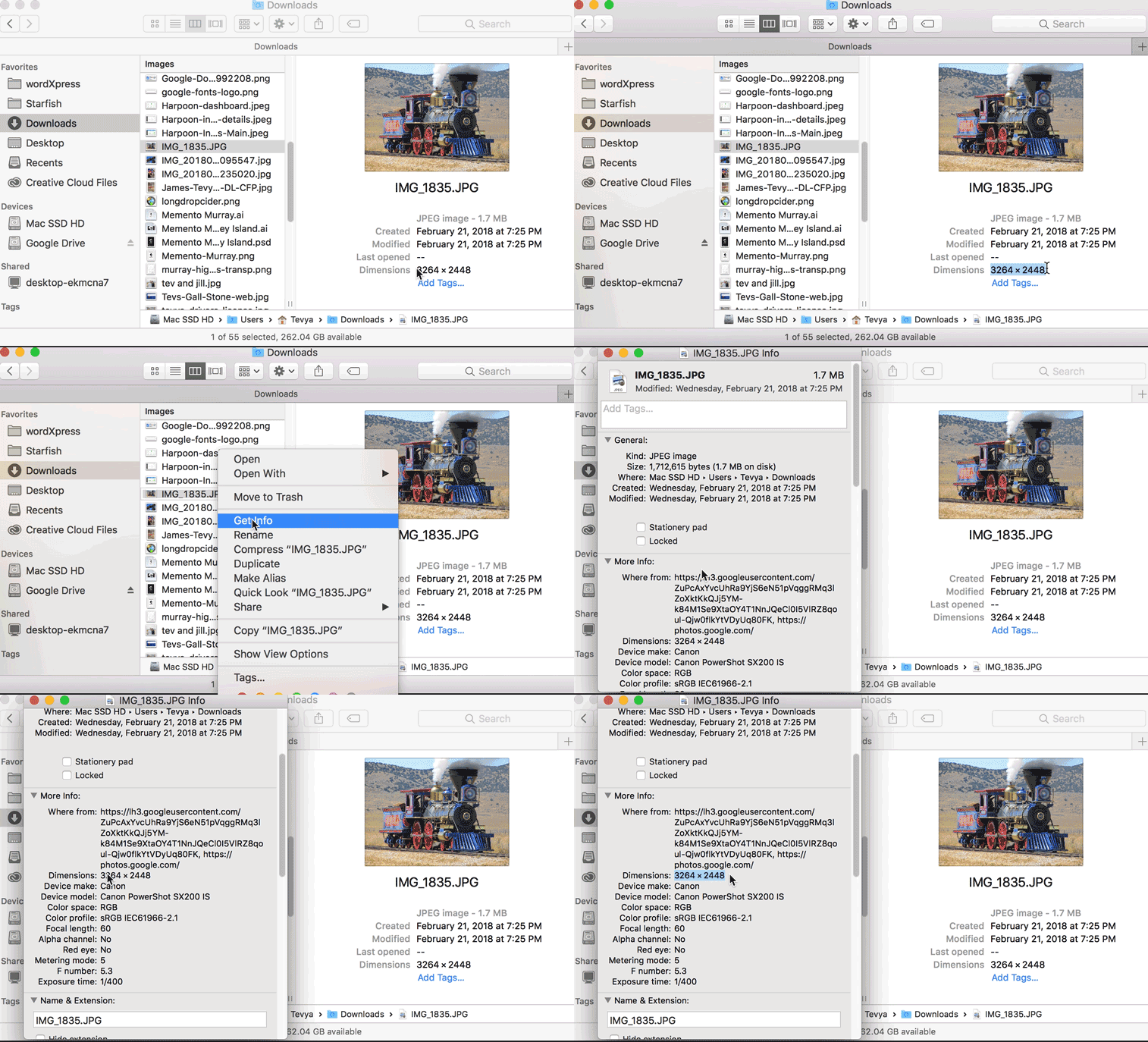
Now that we understand what image resolution is, why is it important? An image that is too small for the space if used will look distorted and pixelated. If you have ever seen Minecraft than that will give you an idea of what pixelated is with it box structures. Seeing pixels might be just fine for Minecraft, but it does not create a good-looking image for a website. How do I Find the Size of my Image? Finding the image size is fairly easy. On a Mac, you can right-click on the image file in Finder and click “Get Info” from the menu.
All the information pertaining to the image will pop up. Find Dimensions and that will be your image size. Remember it is width x height. In Windows, you need to right-click then click “Properties,” from the menu. In the properties window that opens up, click the “Details” tab and look for the image’s Dimensions.
What Size Should my Images Be?
A designer can always scale down an image, but should never scale it up. In other words, a large image can be shrunk to fit a smaller area, but a smaller image cannot be enlarged without affecting the look of an image. A designer would rather you sent them an image that was 5847×2658, even if they only need it for a space 640x480px. They can take this image and resize and even compress it to the correct size for the website. A minimum of 1280px wide should work for most website uses.
Though if it’s going in a large, full-width space, it may need to be more than double that: 2560px wide. If you just don’t have a high enough resolution version of an image for what’s needed, don’t be disappointed if your web designer says it’s just not usable in the place you wanted it.
Is it Okay to Stretch My Image?
Images don’t stretch! They are not yoga masters. When adjusting image size, it needs to be done proportionally or the image will look elongated or squashed. It’s like one of those mirrors that make you look super skinny and tall or fat and short. Images should only be shrunk proportionally. That means adjusting an image while preserving the aspect ratio. In other words, maintaining the same proportion of horizontal vs. vertical pixels. As designers, we don’t stretch images, but we will scale them proportionally or crop them if needed to fit in a space.
What to Send Your Web Designer
So remember: always send your web designer the highest resolution version of the image that you have. And don’t stretch, shrink, or crop it. Trust the web designer to do that. If you’re a wpXPRESS member, we’ll happily handle any of that when we add it to your website.


0 Comments