99designs? Try 800!
These are the the pitfalls and struggles of getting a logo through 99designs. It’s not all bad, but it’s certainly not the wonderful opportunity that 99designs and many of their proponents trumpet. I just want you to know what you’re getting into, if you go that route.
Why We Chose to Rebrand
A few years ago my then-partner Kurt, and I decided to rebrand our little company from FiddlerStudios to Fiddler Online. I’d originally come up with the name “FiddlerStudios” when I was doing freelance print design, video editing, and web design. The “fiddler” part came from “Fiddler on the Roof.” I was named after the main character from that musical, and a “studio” made more sense at the time, due to the variety of work.

That name carried over when we focused entirely on WordPress websites. It quickly became appearant that it was confusing to people though. “Are you a music recording studio?” was the common spoken or unspoken question.
In an attempt to make the name less confusing, Kurt and I agreed we should keep the “fiddler” part to continue the brand recognition we’d built so far, but change it to something more relevant to our focus. The domain fiddler.online was readily available, so we chose that. Now we just needed a logo. I’m a designer and have put together a logo or two in my time, but it’s an art form all it’s own, and I felt like I was too close to it all to offer anything unbiased and universal. So we decided to go with 99designs.
Setting Up the Project
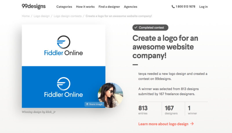
I went in and wrote up what I thought was a pretty good brief on what we were looking for. We ended up getting paying for some upgrades to feature it, as well as have it featured on the 99designs blog. We also guaranteed that a winner would be awarded. We also set the award at $400.
A first-time-user promotion negated the fees, but the upgrades added $150. So all told, we were out $550. We thought it was a respectable amount at the time, but still a good deal, if we got a great logo out of it.
Trying to Run the Competition
Pretty quickly, after launching the competition, the entries started to roll in. At first I was a little disappointed by the quality. Then more and more that I liked started coming! It was excited for a short time, then I started to realize we had a problem! The problem was multi-faceted, but really boiled down to one simple problem: too much volume and no way to deal with it.
It was like getting stuck on a sandbar that’s only above water during low-tide, at high-tide! First one wave: “Okay that was cold but I’m only wet to my waist.” Then the next wave: “Whoa! That went over my head, entirely burying me underwater.” Then by the sixth wave: “Uh, I’m starting to doubt my swimming abilities!” Huge wave after pounding wave came on, beating me into submission.
I assumed that 99designs would have solved this problem, with great sorting, grouping, and comparison tools. But I quickly found out that was not the case at all. They leave you there to swim it out or abandon the sandbar entirely and head for the safety of shore!
The Major Problems with Using 99designs
There were a number of problems that badly need to be addressed if 99designs is ever going to be a great option for getting a logo or other design work done. Here’s a breakdown of each.
Overwhelming Volume of Submissions
The first and single largest problem is the sheer volume of submissions. As I described above, if your reward is high enough and you have paid for some of the upgrades, you’ll quickly find yourself overwhelmed by all the submissions.
Sometimes you’ll get 4 different submissions that are all very similar, from the same designer. You might also get 4 different submissions from 4 different designers, that also look quite similar! But which one is best? And what about the 50 others that came in!
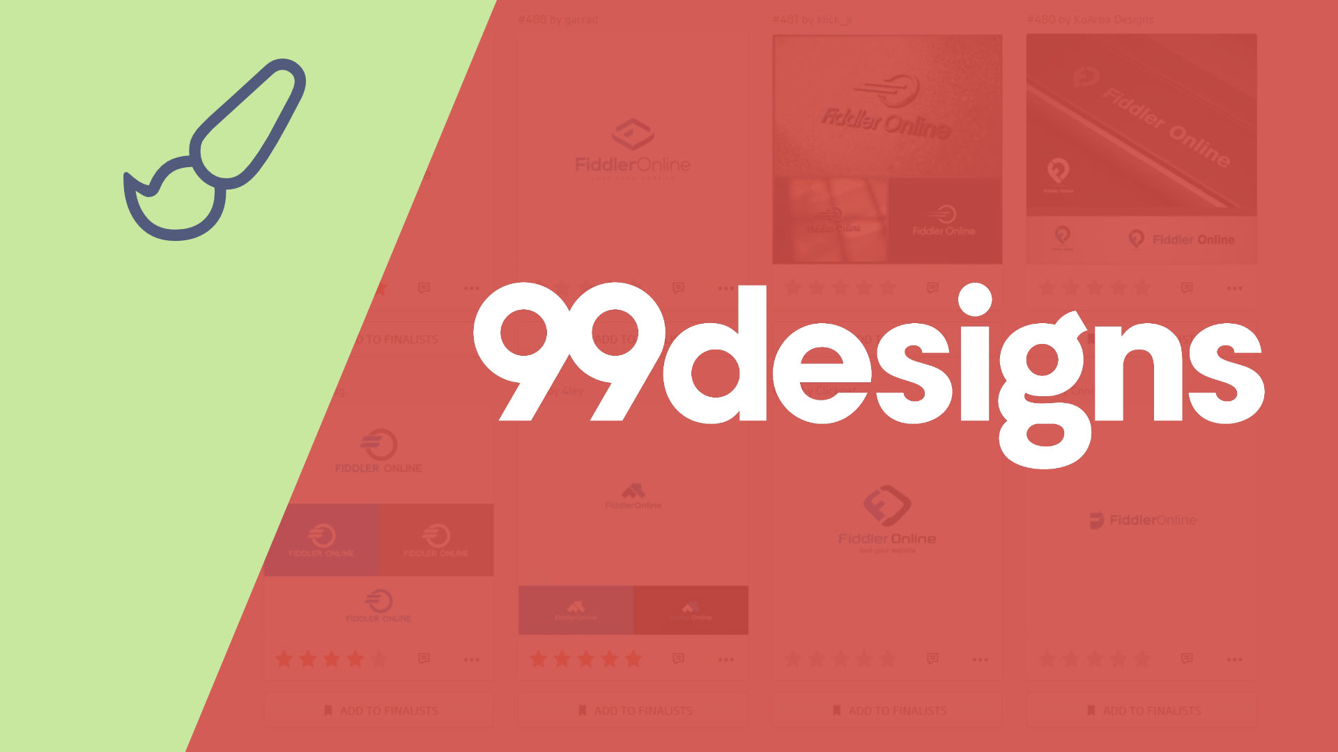
As I alluded to in the title of the post, we ended up with 814 total submissions! Think about that: 800 to go through and decide on 1 that you like the very best!
No Tools to Help Cut Through the Noise
I pretty quickly emailed 99designs and said, “Help! I need some way to sort through all these submissions, categorize them, and group them.” Their response was pretty much, “sorry, we have the tools we have, but we’ll consider your feedback.” This was 3+ years ago. I logged in to their platform today to check and found that they’ve added a new coat of paint, but the tools have not changed from what I can see!
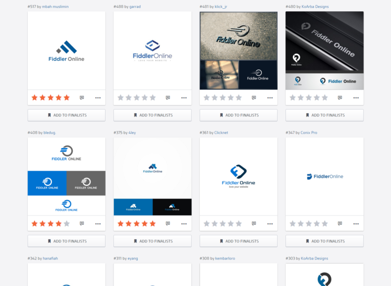
So here are the tools they do have: you can rate designs with 1-5 stars, and you can decline submissions. You can also send out polls to your friends and have them vote on a few that you choose. But getting it down to a few is a tall order!
No Comparison Tools
Just as grouping would have been helpful, it would have been helpful to be able to select a few and compare them side-by-side. The closest thing to this is the polls that I mentioned. You have to create a poll, just to see a few designs that you selected, all on the screen at once. That’s a really poor user experience (UX).
Poor Conversation Tools
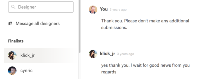
The messaging feature is poorly implemented in my opinion. It is nice to have all communication with a particular designer in once place, but it starts at the top/oldest part of the conversation, and grows longer with time. So you have to scroll to the bottom each time. It appears this has been fixed since then.
Still, conversations don’t take place around a specific submission, instead it’s just a running conversation with the designer, regardless of how many submissions you might be discussing. It would also be nice to have a decent search tool to search through conversations.
Lack of Design Versioning
It would be terribly helpful if each adjustment requested was part of a versioning thread. As it is, if you request tweaks and changes to a design, the designer must submit a new submission with those updates. This creates even more volume and makes it all more confusing since they’re not grouped together or anything.
It would be nice if each submission was a versioning “thread” where the updates to that submission were contained within it, each one updating the latest version of that submission. So instead of 10 submissions that are iterations of the same design, you simply have 1 submission, with 10 revisions. Only the latest would displayed unless you can click in to view the revisions.
Polls Are Inflexible
The polls are a handy little feature to get feedback from friends, teammates, and family. The problem with 99designs implementation is that they’re very inflexible. By default people can rate as many designs as they want. So if some indecisive person (mother?) can give them all 5 stars, which effectively negates the value of the input from that person.
It would be far better if by default, people could only give one 5-star rating, one 4-star, etc. Or at least have settings to make it that way. Or give everyone a single vote: choose your favorite. As it is, the polls can provide pretty irrelevant data, depending on who takes the poll and how they do it.
No Incentive for Polished Design
Whether it’s your original brief or individual feedback you sent about a submission, designers have no incentive to really pay attention to your guidelines.
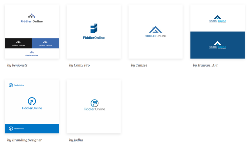
The problem is that there’s no incentive for designers to work hard and produce 1 or 2 polished, well-thought-out designs. They can submit 20 variations of the same design, or 20 totally different ideas if they can come up with them. Many designers seemed to just search stock image sites for logos, and then do their own rendition of as many as they could. One designer (or maybe it’s a group using the same account) submitted 49 designs over the course of the competition. Many submissions had no relevance or relationship to the brief we’d provided. Some designers were just throwing mud on the wall and hoping something would stick.
We also experienced many designers being unresponsive to our messages. We’re not sure if they just ripped-off designs from stock image sites, and so didn’t have the skills to make the adjustments we requested, or what? But they simply didn’t respond, or failed to provide the changes after updating.
So not only did they make our lives harder by submitting lots of submissions that weren’t really viable, but they also got our hopes up, only to be disappointed.
No Copyright Infringement Protection
As mentioned, we started to realize that some people were just stealing stock graphics, or quickly tracing over them, plugging in our company name and colors, and submitting those. Some even seemed to be ripping off actual logos of large corporations and such! 99designs really fails in this area, since you can potentially get into a lot of trouble if you use an “original” logo from them, that isn’t actually original at all.
Time Investment Required
In the end, and because of the problems above, I was forced to use the available tools the best I could to sort out what was helpful and what was not.
I ended up just going through and any that I knew I would never be comfortable with as my logo, I trashed those. Then I’d give 3, 4, and 5 star ratings to what was left. I’d eliminate all the 3 stars, and pass the 4 and 5 stars on to Kurt and put into polls to get feedback from other people.
It was a lengthy, difficult, and time consuming process! Please don’t think 99designs makes getting a great logo easy! They do not. But if you don’t have other options, and are willing to put in the work, it can result in a great logo.
Improving the 99designs Experience
I made a number of suggestions to 99designs about how they could improve the experience. But as mentioned, 3+ years later, they’ve failed to implement all but one of them, as far as I can tell. Here’s some ways they could improve to make their service the amazing experience it claims to be.
Sorting & Filtering Tools That Help
I’d really like to see a grouping feature where you can group similar designs together. This feature alone would have been a massive help! Just being able to group them into similar style/approaches/interpretations, would have been so helpful. Then we could have easily picked a best few within each style.
Tagging could help a lot as well. So you could group by style or similarity, then tag based on theme or some other aspect.
A little artificial intelligence to automatically group submissions, or suggest groups, would really help ease the volume concerns! If they could implement this one feature alone, the experience would be massively improved.
Quick Compare Tool
You’ve seen this on many sites: you can select several products and compare them side-by-side. If 99designs implemented something like this, it would make it far easier to go through and figure out which of several options that are similar you like best.
Search Functionality
I’d also like to see a search tool. A way to quickly search for a designer by name, or find a conversation based on something you chatted with them about. It should also search groups (see previous item) and perhaps other features.
Better Incentives for Designers
It seems like there could be a way to force designers to submit 1-4 designs that they put a lot of time into. For example, limit their submissions to 4. That rule alone would have cut out a huge amount of clutter that I had to sort through. I’d be much more satisfied with 50 really great designs to give feedback on and eventually narrow down to 5 or 10 top contenders, than over 800! Especially when so many of those were knock-offs, and only slightly different variations of the same design.
Identify Potential Copyright Issues
A little artificial intelligence on the copyright front would be helpful too. They could integrate with a tool like TinEye to help identify similar graphics/logos on other sites and flag them as potentially illegal copies. You could then go to a screen that lest you review the submission side-by-side with the design it’s potentially infringing on and decide if you think it’s too similar to pursue.
Benefits of 99designs
After all that, there are some upsides. I’m not a hater trying to “expose” 99designs. I just want people to go into a 99designs competition fully informed about what it will take to get a great logo or design, if they run a competition.

We were happy with the logo we ended up with in the end. But it took a lot of work to get it whittled down to the finalists. We were glad to have it in the end, but I remain unconvinced as to whether it was worth the time-cost involved to get to the end result. Even though we paid $550 for the logo, it cost many hours of my time, for a total cost far above that number.
Talented Designers
Despite all the garbage, there are some talented designers on 99designs. You get access to them. And many end up working for you for free, since you don’t pay them for their work, unless they’re the one selected as the winner.
Options for the Price
You get a lot of options for the price! Even though options is a major downside in my experience, it can also be an upside. If you don’t know what you want, you get to look at a lot of options to hone in on what you like and dislike.
Should You Use 99designs?
In the end you have to decide if 99designs is right for you. Can you put in the time and effort to go through hundreds of submissions and filter out all the garbage, then message back and forth with the designers to refine their designs, as you continue to whittle it all down to 1 final design? If you’ve got the time, and don’t have other great options to get a logo made, it could be a great fit for you.
In the end we liked our resulting logo a lot and used it for a time. We’ve since rebranded as wpXPRESS (though Fiddler Online is really the company name).
When rebranding our WordPress maintenance and support services as wpXPRESS, I decided to collaborate with a logo designer I know. I also worked with her to create the Starfish Reviews logo. So I’m certainly not using 99designs, but it’s still worth your consideration, unless all the problems I’ve outlined above are really off-putting for you.




0 Comments