WordPress 4 beta 1 was released today. I checked it out and am really pleased. The last few major WP releases have had BIG changes, with really cool new features. So far, WP 4 doesn’t have anything too major, but takes care of 1 major nagging usability issue that’s plagued WP since the start, and does some other small but needed enhancements that are worth getting excited about.

 There are a few other cool tweaks coming to WP 4, but these are the 3 I’m most excited about. What say you? Exciting stuff?
1. No More Dual-Scrollbars in Post Editor
Everyone who’s used WP much has been frustrated by this one: there’s the main browser scrollbar that moves the entire WordPress post editor screen up and down. Then there’s another scrollbar within the body content editor for the post. The 2 mean you have to scroll in the right place, and if you don’t you’ll suddenly not be able to see the content you’re editing, etc. It’s super annoying and has bugged me many times. Fortunately, this is fixed in WP 4. Now the post body content area just expands so that it’s as long as your post. No independent scrollbar there. But to make sure you don’t have to scroll back to the top, to format text and insert images, the text formatting toolbar, as well as the media button and other elements, stick to the top of the screen when you scroll to the point they would normally go off of the screen. It works really well:
2. Grid View in the Media Library
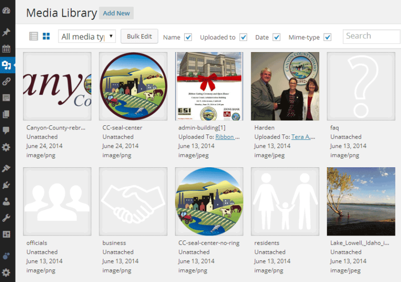
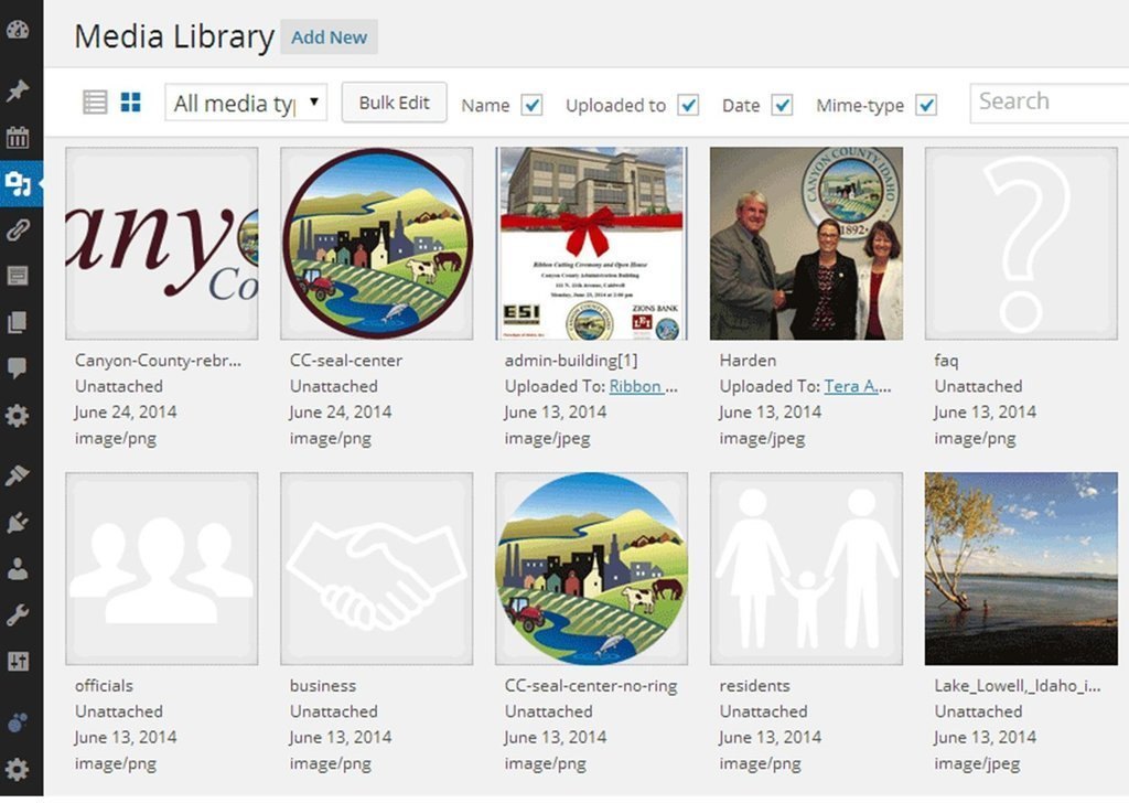
The Media Library has long been a crucial tool for WordPress users, but its functionality hasn’t matched the intuitive design of the Add Media button for several major updates. Fortunately, the latest update introduces a new grid view that enhances the user experience significantly. This new layout allows users to view their media files in a more organized and visually appealing way, akin to the Add Media window. With this grid view, users can easily browse through their images, videos, and other media without feeling overwhelmed by a long list. When you click on an image in the grid view, it opens the file details in a lightboxed pop-up window instead of redirecting to a new URL. This streamlined approach not only saves time but also makes it easier to edit file details, add alt text, or manage attachments without losing your place in the Media Library. Overall, the new grid view feature simplifies media management, making it more user-friendly and efficient. Be sure to check out the featured image at the top for a preview of this enhanced functionality.3. Embedded Media Previews in Content Editor
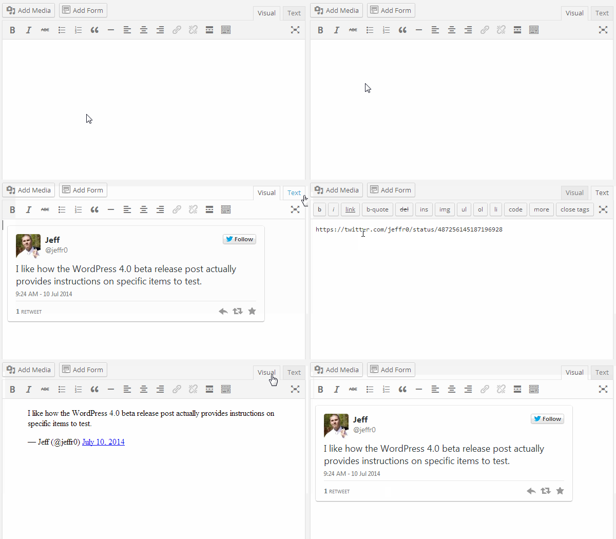
With the release of WordPress 3.9, users received the valuable upgrade of seeing previews of galleries directly within the content editor, replacing the old method of using a simple placeholder image to represent them. This enhancement allowed for a more visually engaging editing experience, making it easier for content creators to ensure their galleries were set up correctly before publishing. Building on this foundation, WordPress 4 takes it a step further by introducing previews for external media embeds. Now, when you paste a plain YouTube video or Tweet URL into the post editor, you will instantly see a preview of the video or tweet instead of merely a text link. This exciting feature transforms the editing experience, allowing users to visualize how their content will appear to visitors without having to save or publish the post first. Whether you’re embedding a video, tweet, or even content from other platforms, the ability to see a live preview enhances the workflow for bloggers and website owners alike. This update fosters a more dynamic and interactive environment in the content editor, enabling users to craft richer and more engaging posts. As you continue to create and edit your content, this new functionality will save you time and help you maintain a polished look for your site. So now when you paste in a plain YouTube video or Tweet URL, you’ll see a preview of the video or tweet (or any number of other embeds) right in the post editor: There are a few other cool tweaks coming to WP 4, but these are the 3 I’m most excited about. What say you? Exciting stuff?


0 Comments